British Fencing
Improved User Satisfaction By 146.3%
Toolkit
Figma, Optimal Workshop, Jira, Ballpark, Useberry
Timeline
3 Weeks
Team
UX Research Team
Improved User Satisfaction By 146.3%
Figma, Optimal Workshop, Jira, Ballpark, Useberry
3 Weeks
UX Research Team

British Fencing approached us as their users consistently reported difficulties in navigating their website. It was cluttered, overwhelming and key info was buried within their site structure. Their primary goal wasn't a visual overhaul, but to research and outline the most efficient way for British Fencing to restructure their information, based on user insights. Providing a structure that they could confidently build upon for future digital projects.
Our research phase combined qualitative and quantitative methods to uncover usability challenges. Our user group included competitive fencers, coaches, parents, and total beginners — helping us identify universal blockers and audience-specific struggles.
Interviews confirmed the quantitative data, revealing a deep frustration with the site's complexity and information architecture. Key themes emerged:
"I didn't feel like the information that I need as a parent new to fencing, was well presented to me."
"It feels overcomplicated... they are trying to get too much information on one page."
"It feels like it's been put there by someone for their reasons with things that people might access for their own reasons."
"If I'm looking for something I'm going to use Google because the menu and the context menus beneath that, they're just really difficult to understand."
An audit against usability heuristics highlighted critical issues that aligned with user feedback.
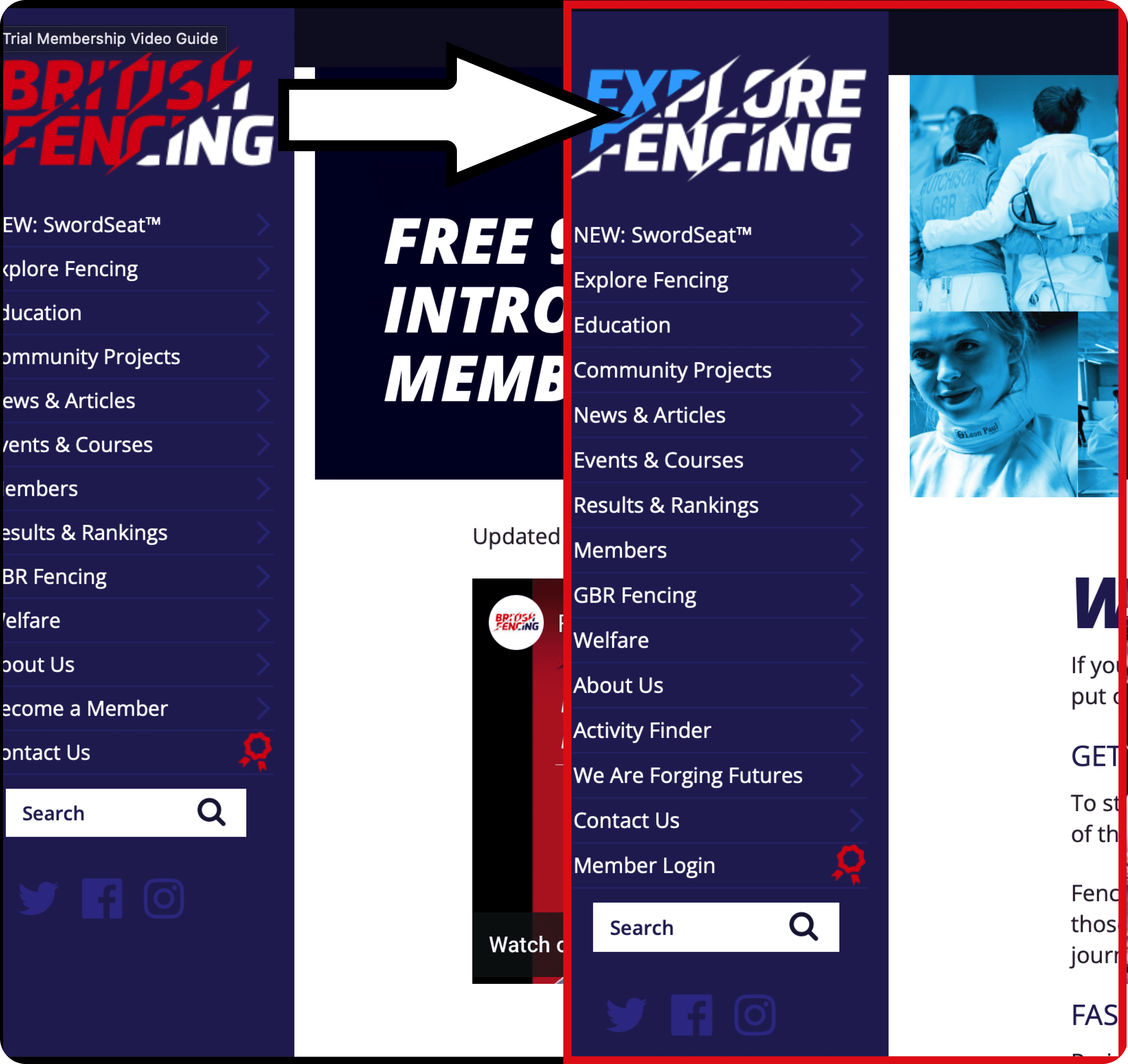
The site lacks breadcrumb navigation, making it difficult for users to know their current location and harder to return to previous pages.
Two inconsistent navigation bars create an unpredictable journey for users, especially those unfamiliar with the site or people with limited technical skills.
Our research was synthesized into a key persona, Tom, to represent our primary user group and ensure our solutions directly addressed his needs and frustrations.

Competitive Fencer & Coach
Bio: Tom is an experienced fencer and coach who uses the British Fencing website to find event schedules, rankings, and results. With a full-time job, he doesn't have much free time and needs to find information quickly.
"Knowledge within fencing empowers me"
"How might we help Tom save time using the British Fencing Website so that it becomes a source of joy rather than frustration?"
We conducted an open card sort with 21 participants to understand how users naturally group content. This allowed us to formulate a new, user-centric information architecture.
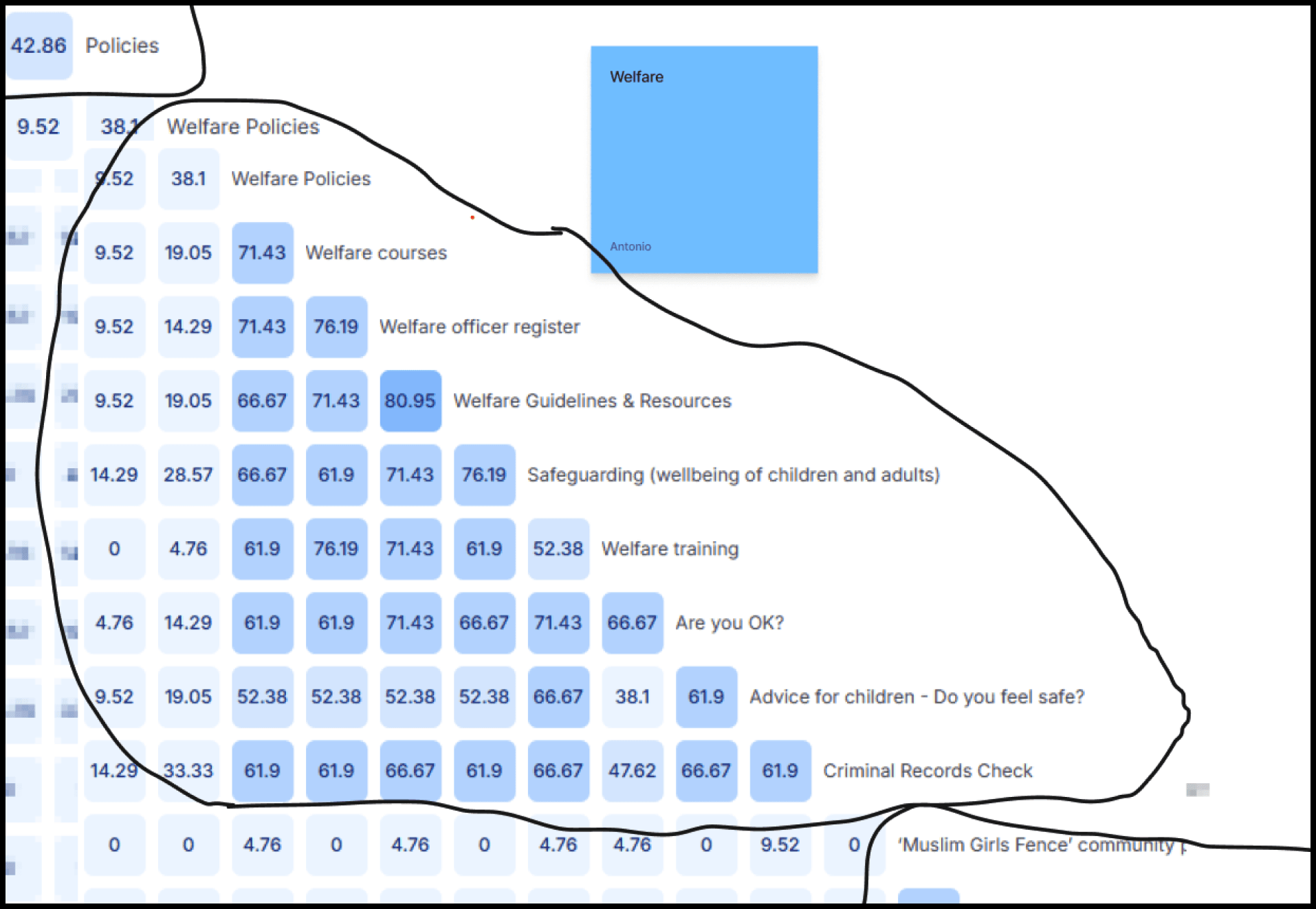
To validate the new site map, we ran tree testing with 15 users. The results showed a dramatic improvement across all metrics.
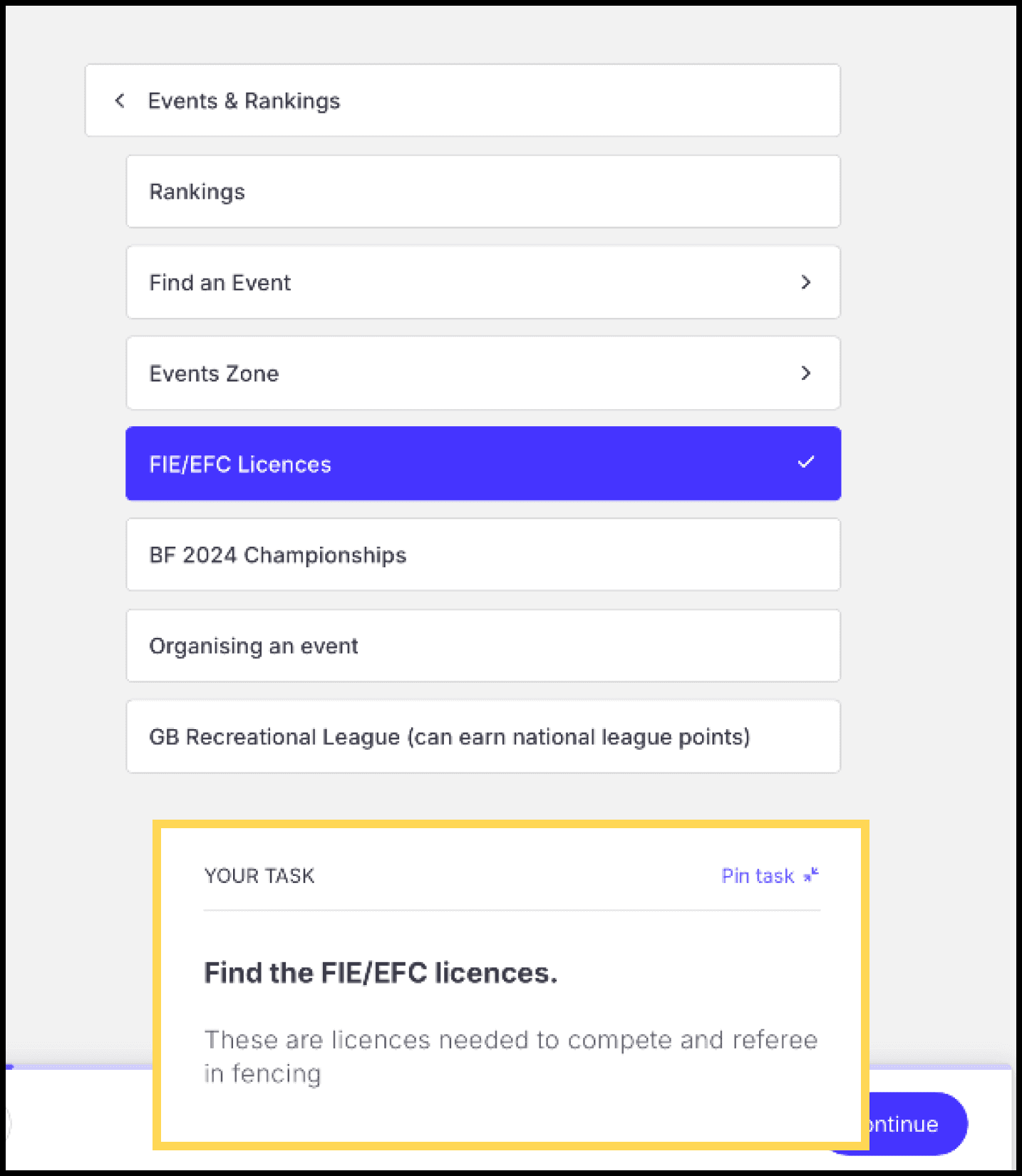
While a high-fidelity prototype wasn't a primary deliverable, we built a conceptual model to visualise how the new information architecture would translate into a functional navigation system, providing a clear blueprint for future development.